Carysfort Partners
Logo and Website Design
*Hover over images to learn more
I had the opportunity to work with the founder of Carysfort Partners to help him with parts of the design of his business, particularly his logo and website. The first step was to work on the logo, which began with researching logos of other investment businesses for inspiration and industry comparison. I also reviewed the website that the founder originally created for further inspiration.

In addition to looking at different logos from the investment and acquisitions field - the same field as Carysfort Partners - I took a screen shot of the website that the founder had created before working with me. This gave me an idea of the colors the founder might want to use.
After doing research we transitioned into brainstorming our own ideas. While designing the first wave of logo iterations I used other company logos in addition to what the founder suggested as inspiration.

The different motifs used throughout these logo drafts were inspired by the research as well as from the website that the founder originally created. For example, on his website he had an image that he took at Carysfort Reef of a well known lighthouse. You can see that some of these drafts have that as a motif.
After coming up with the first wave of logo drafts, the founder and I discussed the progress. We agreed that since the name of the business is based on Carysfort Reef in the Florida Keys - a place that the founder and his family visited on family vacations when he was younger - the logo might work better with a nautical theme.
With this new direction for me to follow for the next round of logo iterations, I found images that evoked a nautical feeling or directly related to Carysfort Reef for inspiration.


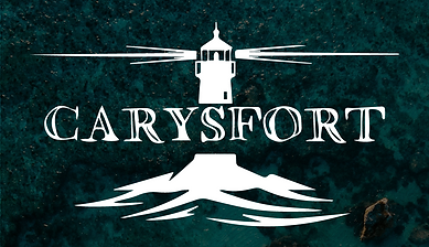
The wavy lines that I used in some of these drafts are meant to represent waves of the sea. The lighthouse mimics the lighthouse from Carysfort Reef itself. Finally, the outline used in some of the drafts is a partial outline of a section of Carysfort, as explained in the image above.
After reviewing the different logo iterations I created, the founder showed me a version of a logo that he had created himself at some point. We discussed my drafts along with his draft of a logo; he realized he wanted to use the logo he created. However, the original draft of the logo he created was generated online and he could only get a screenshot of it, which is definitely not suitable for his purposes. So I got to work editing it accordingly, also making a few new drafts based on his logo to show him what color integration could look like.

Screenshot founder took of the logo he generated.

For these drafts, I drew around the logo (minus the type) the founder created and then turned the "drawing" into shapes. I was then able to add in some color to show him what that could look like. I also tried to find the closest typeface to the one that he used, but decided to try lower case letters.
The founder decided to stick with a simple black and white color palette for the logo. He also preferred the typeface that he found when generating his logo, so I essentially just traced his original logo with the pen tool and vectorized it so it is scalable without any quality loss. I also made sure to add my own twist to the letters in order to make them unique.
With the logo done, we moved on to designing the website. We started by agreeing to move on from the site he created in order to make sure everything is cohesive on the new site. From there we both did research on other websites in the investment business field and then compared notes.
Finally we decided that the website would be most successful as a one page scroll-down format with short sections to create the smoothest user experience. With the format established, I got to work gathering some photographs as inspiration and potential content for the site.


After I gathered these and a few other images I started drafting for the website. I actually drafted two different sites, a single page and a multipage site, just to make sure the founder still wanted the single page site that we agreed on before.
Single page
Multipage
With the two kinds of website layouts drafted, the founder confirmed that he preferred the single page version. The next step was to decide the final order of the sections on the site. Because Carysfort Partners has an audience that is diverse in age (ranging from the early professional years to the golden years), we decided that there should only be what is absolutely necessary on the site: a "Landing" section (the section you immediately see when you land on the page), a "Focus" section, an "Our Values" section, and finally an "About Me" section (titled "Leadership"). The contact information would be embedded in the footer for easy access as well.
So, I designed a website with the parameters we discussed. Through more collaboration with the founder where he edited some of the material and the way it is shown, we were finally able to achieve his vision. The website is now live and ready to be seen.
The final step in our work together was to create the icons that are used for different social platforms.
Internet Browser Icon

Text Icon


Main logo
